
Our Story
Taina Instructional Design Studio was born from a journey that refused to stay linear — a journey shaped by my experiences in science, education, pharmacy, customer service, and the constant navigation of cultures, languages, and learning spaces. After years of teaching, designing, mentoring, and problem‑solving, I realized something powerful: learning experiences could be more than functional. They could be cultural, emotional, and deeply human.
I kept seeing the same gap everywhere — organizations needed learning that wasn’t generic, but crafted. Instruction that honored identity, told a story, and made learners feel seen. I wanted to build a studio where modern learning science met Puerto Rican heritage, where creativity wasn’t an accessory but the foundation.
So Taina wasn’t simply founded. I claimed it — as a declaration of my voice, my roots, and my expertise. A studio shaped by my journey from Juana Díaz to Chicago to Charlotte, from pharmacy technician to educator to instructional designer, from student to creator.
Our Logo
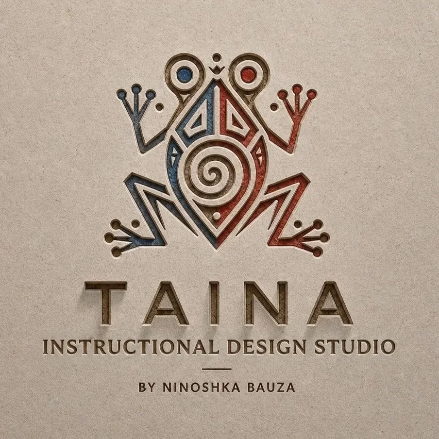
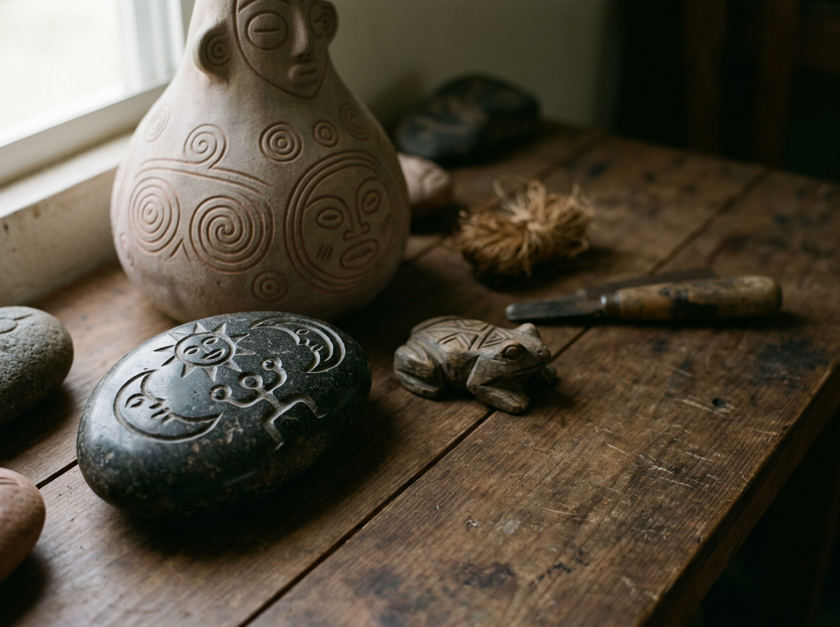
The Taina logo draws inspiration from the Taíno culture, the Indigenous people of Borikén (Puerto Rico). The frog motif — reminiscent of the coquí, Puerto Rico’s iconic symbol — carries layers of meaning that align beautifully with your studio’s mission.
What the Logo Represents?
The Coquí / Frog Symbol
In Taíno art, the frog is a symbol of fertility, renewal, and transformation. It represents life emerging from water, growth, and the constant evolution of the natural world. For an instructional design studio, it becomes a metaphor for learning: the ability to grow, adapt, and transform through knowledge.
The Spiral at the Center
Spirals are one of the most recognizable Taíno symbols. They represent continuity, cycles, and the flow of energy — a perfect reflection of how learning is never static. It moves, expands, and deepens over time.
Geometric Lines and Minimalist Style
The clean lines and modern aesthetic honor your preference for minimalist branding while still preserving cultural authenticity. It bridges ancient symbolism with contemporary design, just as your studio bridges heritage with modern learning science.
Blue and Red Accents
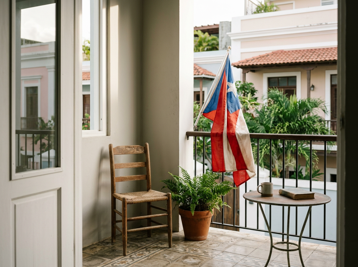
These colors subtly echo Puerto Rico’s flag, grounding the brand in identity without overwhelming the design.
Why This Logo Matters?
It’s not just a mark. It’s a story.
It tells your learners and clients that Taina Instructional Design Studio is rooted in culture, built with intention, and committed to creating learning experiences that honor identity, creativity, and transformation.
It’s a reminder that every project is an act of renewal — a new cycle, a new learner, a new opportunity to grow.
-
![]()
Focused on greatness
For happy clients
-
![]()
Design Experience
Across web, mobile, and print
-
![]()
Community Advocate
For a more inclusive world







Get in Touch!
Schedule a free 1:1 introductory session with me to discuss your web design needs.

FAQ

-
First things first, don't be nervous. We'll start with a free consultation to determine your design needs (and if we'll make great collaborators).
-
Pricing is based on both the project's scope and your desired timeline. (I promise fair rates and will always require your approval before we begin).
-
Timelines depend on the project, but I generally dedicate up to a month to each client, with the possibility of an extension based on my availability.