Welcome to Taina Instructional Design Studio

Designing learning with intention, clarity, and cultural depth — for the healthcare world.
At Taina Instructional Design Studio, we craft healthcare learning experiences that are purposeful, engaging, and rooted in modern instructional design principles. Our work blends clinical accuracy with creative strategy, ensuring every module, job aid, or training program supports real performance, real competency, and real transformation in patient‑centered environments.
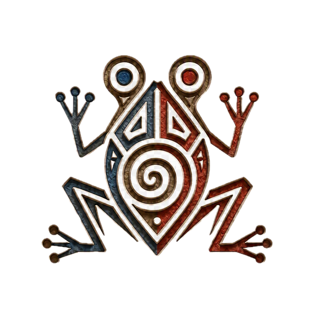
Guided by the Taíno‑inspired coquí symbol — a mark of renewal, growth, and continuous learning — our studio brings together clean design, thoughtful structure, and a learner‑centered approach tailored to the unique demands of healthcare. Whether developing digital simulations, compliance training, pharmacy education, clinical workflows, or full learning ecosystems, we focus on solutions that feel intuitive, human, and impactful.
With every project, we honor the balance between cultural identity, instructional rigor, and the high‑stakes nature of healthcare learning. Our designs help professionals build confidence, reduce errors, strengthen communication, and deliver safer, more compassionate care.
Explore our services, view our portfolio, and discover how intentional design can elevate your organization’s healthcare learning experience.
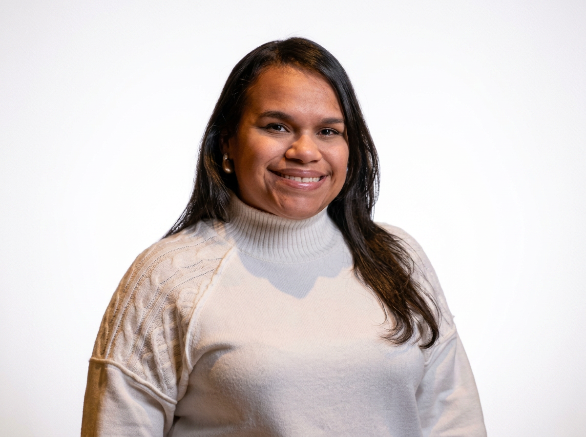
Meet The Designer Behind Taina Instructional Design Studio
I’m Ninoshka L. Bauza-Santana, an instructional designer with a strong foundation in healthcare, education, and performance support. My career began in pharmacy, where I spent years navigating clinical workflows, patient safety requirements, and the fast‑paced realities of frontline care. Those experiences shaped the way I design today — with clarity, empathy, and a deep respect for the people who rely on accurate, accessible training.
I hold an Associate Degree in Pharmacy Technician, a Bachelor’s in Forensic Psychology, and I’m completing my Master’s in Instructional Design. Along the way, I’ve taught pharmacy technician students, led customer service teams, and developed learning solutions that support healthcare professionals in delivering safer, more confident care.
Through Taina Instructional Design Studio, I bring together learning science, real‑world healthcare experience, and creative problem‑solving to build training that feels intuitive, purposeful, and human. I’m passionate about transforming complex information into learning experiences that empower teams, strengthen performance, and make a meaningful impact in clinical environments.
Our Story
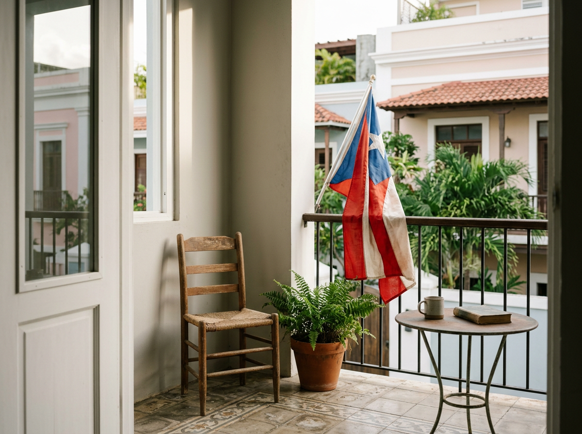
Taina Instructional Design Studio was born from a journey that refused to stay linear — a journey shaped by my experiences in science, education, pharmacy, customer service, and the constant navigation of cultures, languages, and learning spaces. After years of teaching, designing, mentoring, and problem‑solving, I realized something powerful: learning experiences could be more than functional. They could be cultural, emotional, and deeply human.
I kept seeing the same gap everywhere — organizations needed learning that wasn’t generic, but crafted. Instruction that honored identity, told a story, and made learners feel seen. I wanted to build a studio where modern learning science met Puerto Rican heritage, where creativity wasn’t an accessory but the foundation.
So Taina wasn’t simply founded. I claimed it — as a declaration of my voice, my roots, and my expertise. A studio shaped by my journey from Juana Díaz to Chicago to Charlotte, from pharmacy technician to educator to instructional designer, from student to creator.
The Taina logo draws inspiration from the Taíno culture, the Indigenous people of Borikén (Puerto Rico). The frog motif — reminiscent of the coquí, Puerto Rico’s iconic symbol — carries layers of meaning that align beautifully with your studio’s mission.
It’s not just a mark. It’s a story. It tells your learners and clients that Taina Instructional Design Studio is rooted in culture, built with intention, and committed to creating learning experiences that honor identity, creativity, and transformation. It’s a reminder that every project is an act of renewal — a new cycle, a new learner, a new opportunity to grow.
The Coquí / Frog Symbol
In Taíno art, the frog is a symbol of fertility, renewal, and transformation. It represents life emerging from water, growth, and the constant evolution of the natural world. For an instructional design studio, it becomes a metaphor for learning: the ability to grow, adapt, and transform through knowledge.
The Spiral at the Center
Spirals are one of the most recognizable Taíno symbols. They represent continuity, cycles, and the flow of energy — a perfect reflection of how learning is never static. It moves, expands, and deepens over time.
Geometric Lines and Minimalist Style
The clean lines and modern aesthetic honor your preference for minimalist branding while still preserving cultural authenticity. It bridges ancient symbolism with contemporary design, just as your studio bridges heritage with modern learning science.
Blue and Red Accents
These colors subtly echo Puerto Rico’s flag, grounding the brand in identity without overwhelming the design.
Our Logo
Let’s connect! Schedule a 1:1 with me to meet